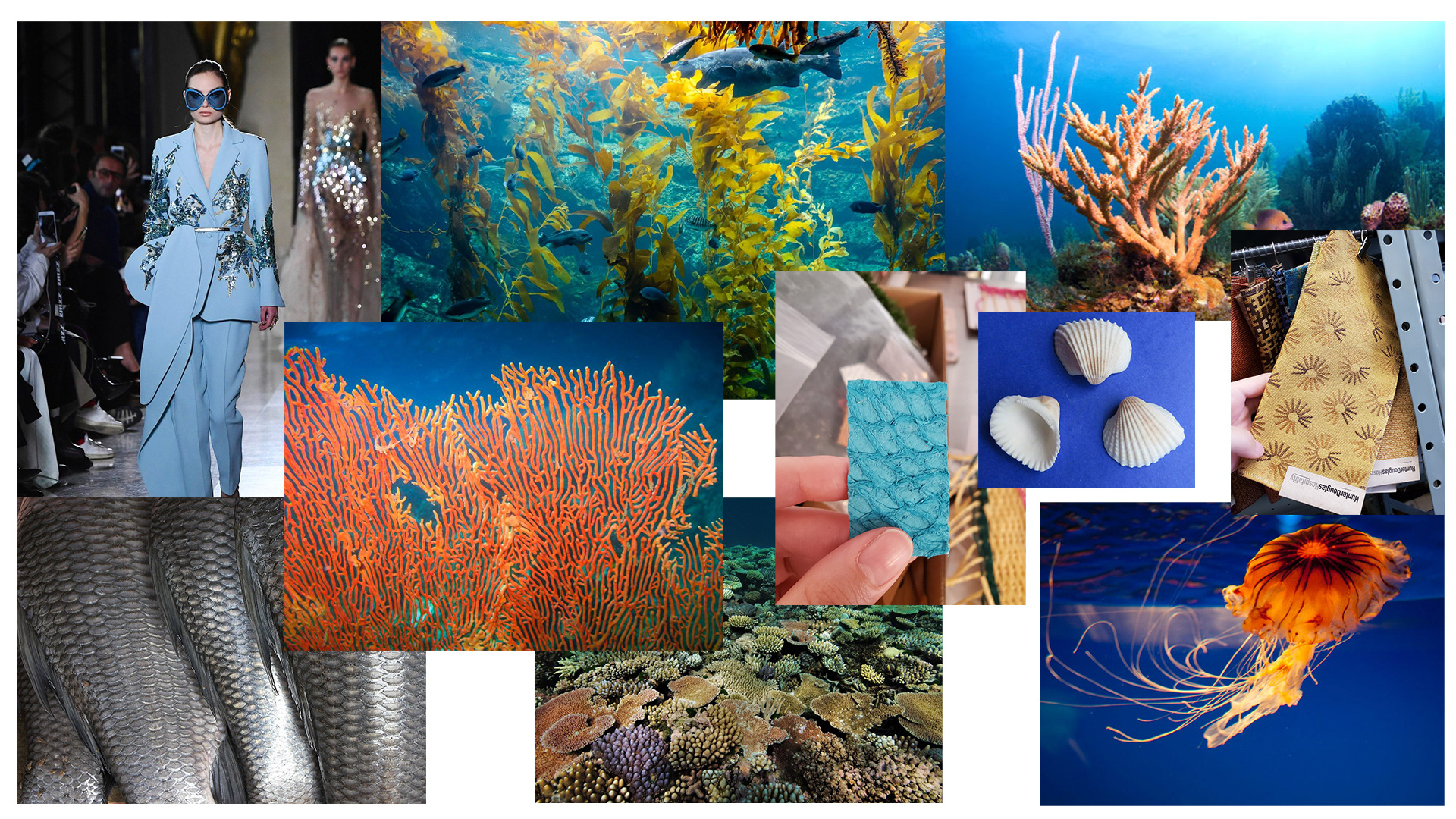
My process for designing outfits started with research. As a class, we visited the on-campus materials lab, where I was able to take photos of a wide range of interesting materials that I kept as reference and inspiration before I started designing. Learning about fish leather in particular was really helpful, as it gave me a strong visual starting point for the scaly look of the eventual concepts I produced. From there, I looked up as many visually unique types of underwater motifs as I could think of to incorporate into my pieces as a huge goal of mine was to create a sense of conceptual unity. I wanted to make sure that my outfits would pull from materials that made sense for the environment that their wearers would be living in, while also thinking about how their positions of power would also mean that they would have access to much more luxurious materials than common folk.
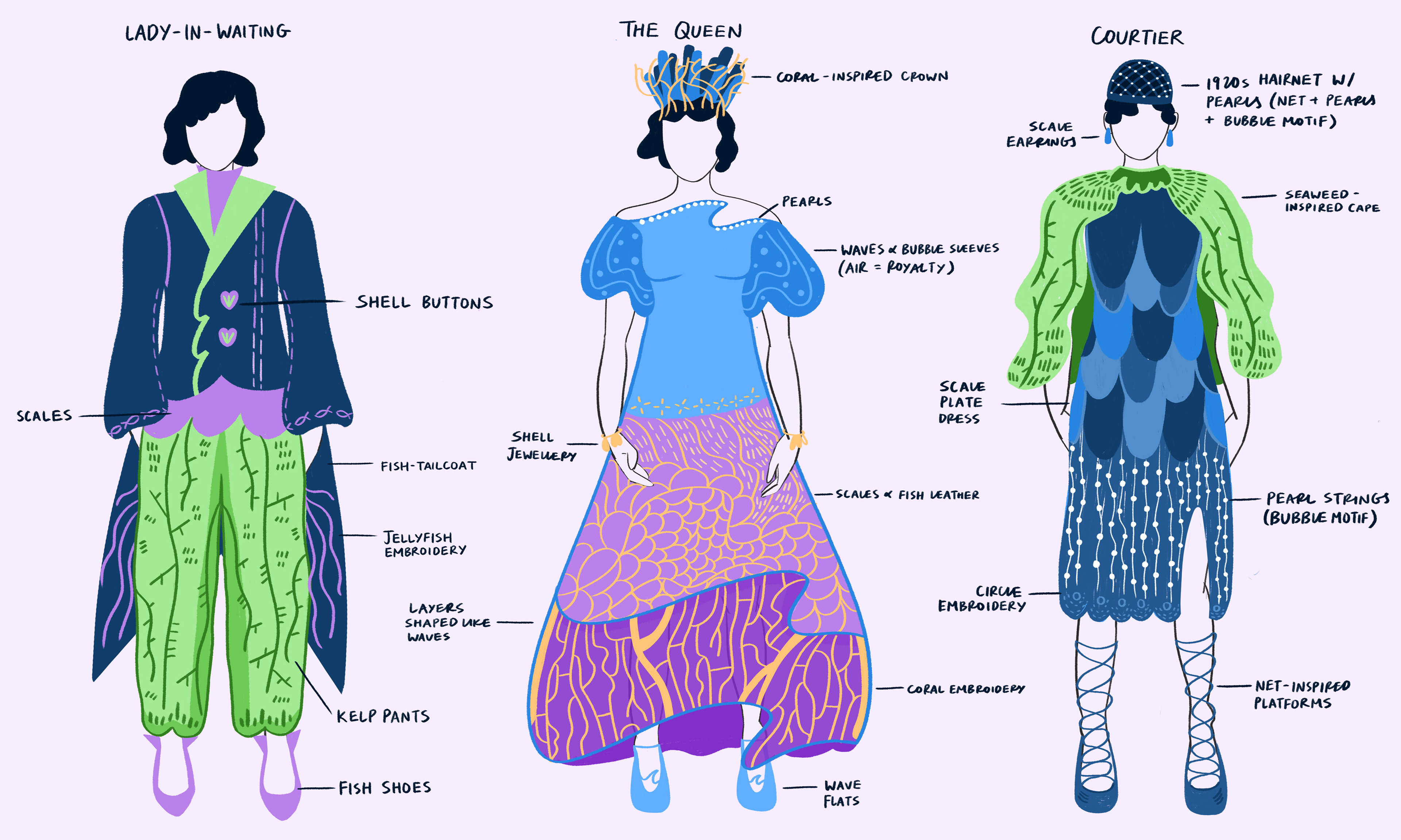
I ended up reinterpreting materials such as kelp, pearls, scales, and netting into clothing materials, while also pulling organic and biomorphic shapes directly into the silhouettes of my pieces, like the lady-in-waiting’s fish-tail coat or the wavy hem of the queen’s dress. In creating the outfits themselves, I placed a strong emphasis on pattern, colour, value, and contrast. I chose a few specific tones from Coral City’s agreed-upon blue-purple-green palette and repeatedly used them across all three outfits so that there was a sense of cohesion and harmony both within my project and externally with the rest of the world, while also allowing for difference in the individual designs by giving them unique patterns. The repeating scales on the courtier’s outfit contrast both in colour and style to the delicate coral embroidery on the queen’s dress, for example. I also wanted the outfits to be visually striking, which required a focus on value - I therefore chose multiple shades of the same colour to allow for contrast even in my flat designs, and played with colour symbolism in how the queen’s outfit included much more purple—a colour traditionally associated with royalty in our world.
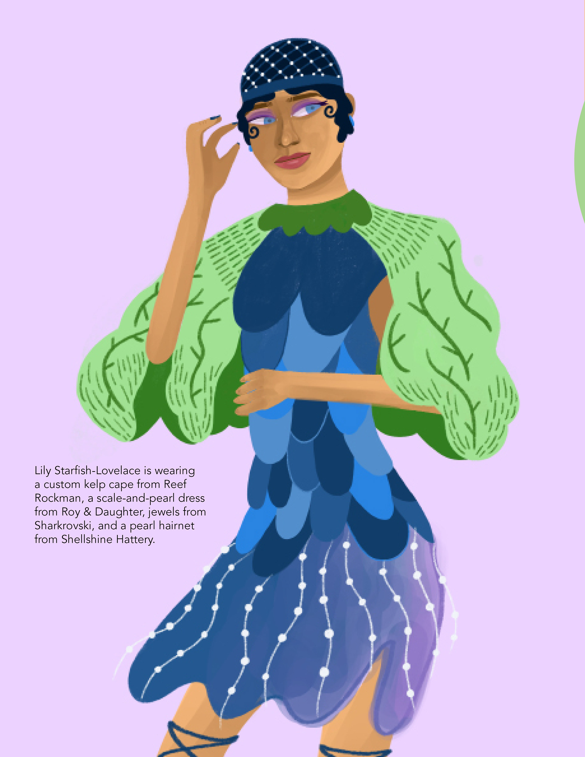
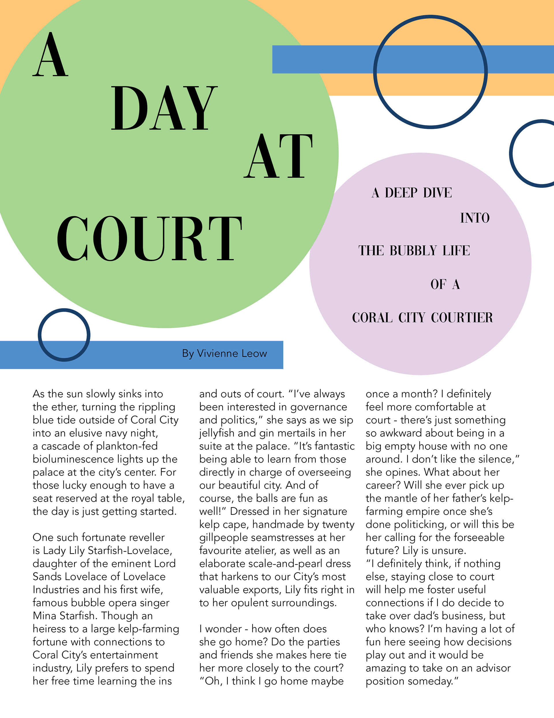
I went through a similar process for the more rendered illustration, specifically picking skin-tone values to create contrast with the outfit itself while also providing shading on the face and arms that made it look more naturalistic. When deciding on a pose, I wanted to incorporate a sense of motion in the work to heighten its visual interest and energy, so my final illustration has a strong psychic line from the model to a point off the page, and the dress is not static but sways in the opposite direction to suggest a sense of a snapshot-in-motion. With the final result of the magazine spread, I pulled colours directly from my illustrations to tie everything together, and when I wrote the short text for the article, I used a lot of underwater terminology to further enhance the believability of the world and solidify that sense of unity.