Context
I've worked as a freelance graphic + layout designer for Tribe Gaming since 2021. I handle monthly partnership reporting decks, pitch decks, case studies, campaign reports, and other miscellaneous design tasks (website wireframing, creating bespoke deck themes).
Brief
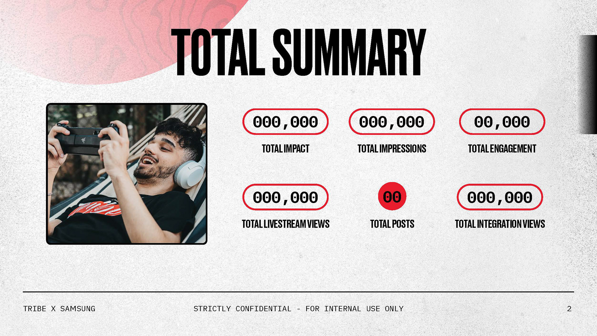
As I design multiple decks with different requirements at the same time, the briefs tend to be unique in their specific details. In general, however, I receive a rough outline of quantitative and qualitative data from the Accounts team, which I then translate into eye-catching and easy-to-read slides for the team to present during meetings.
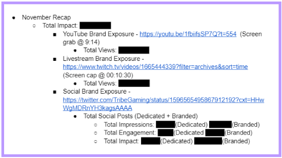
This is the skeleton I'm provided on Google Docs.
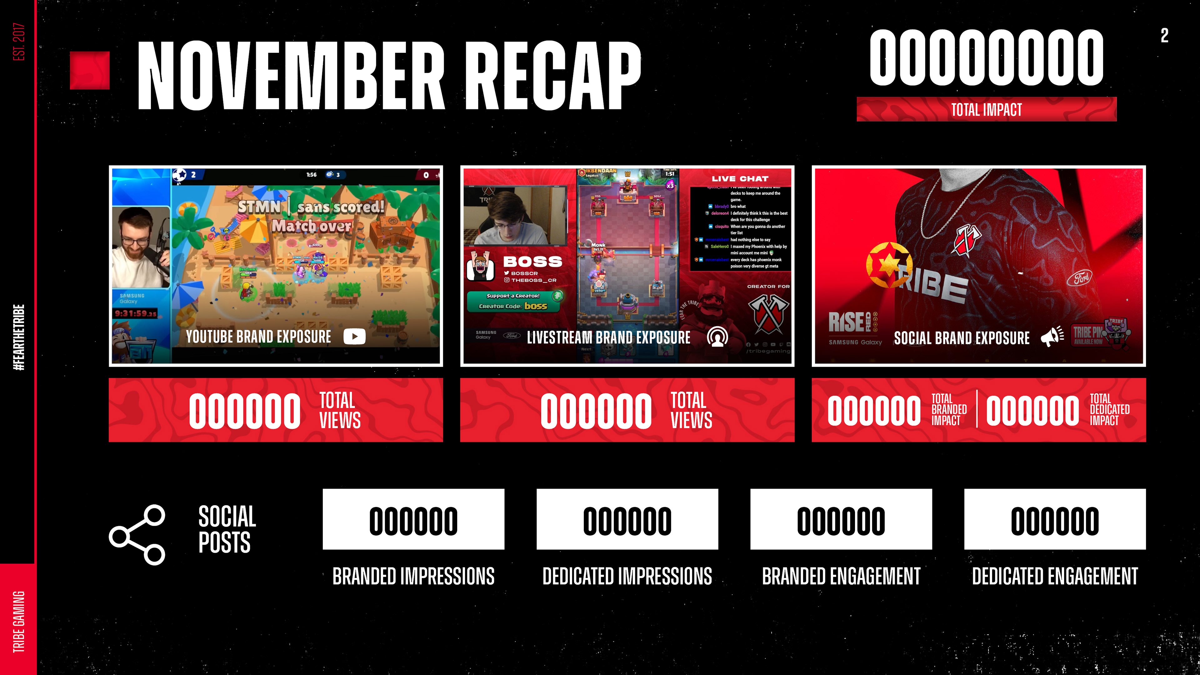
I translate the skeleton into layout in InDesign.
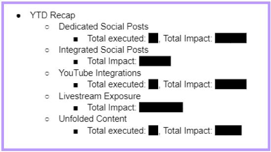
A slide might not have any assets included - just the data.
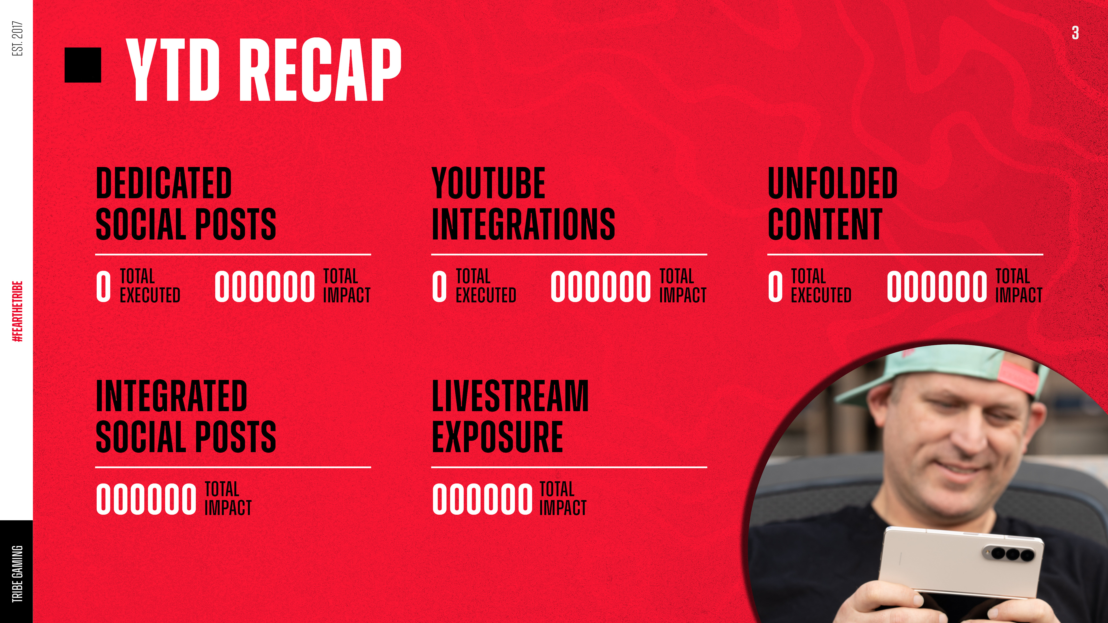
Based on the layout that I develop, I find images to use as necessary.
Process
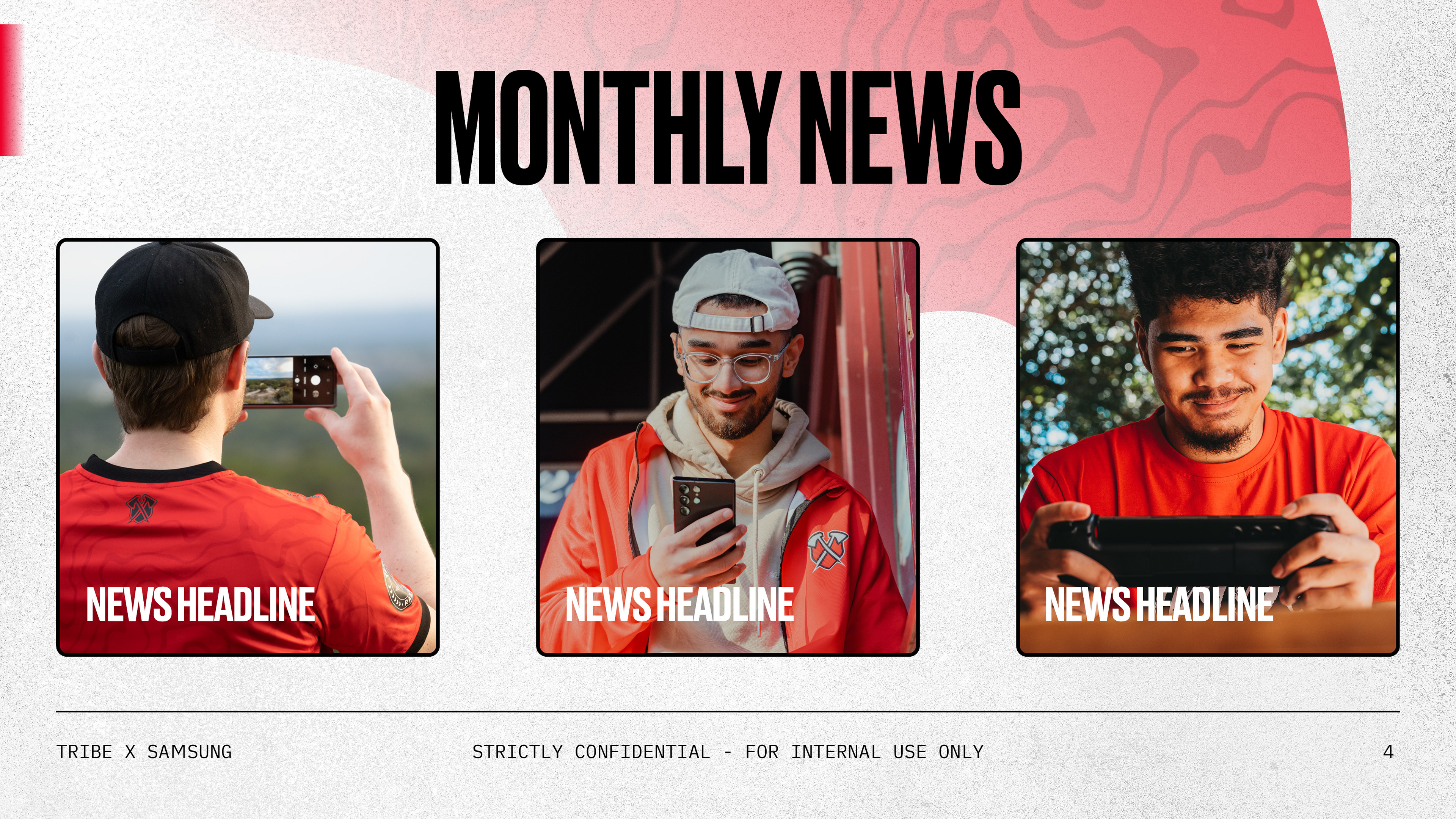
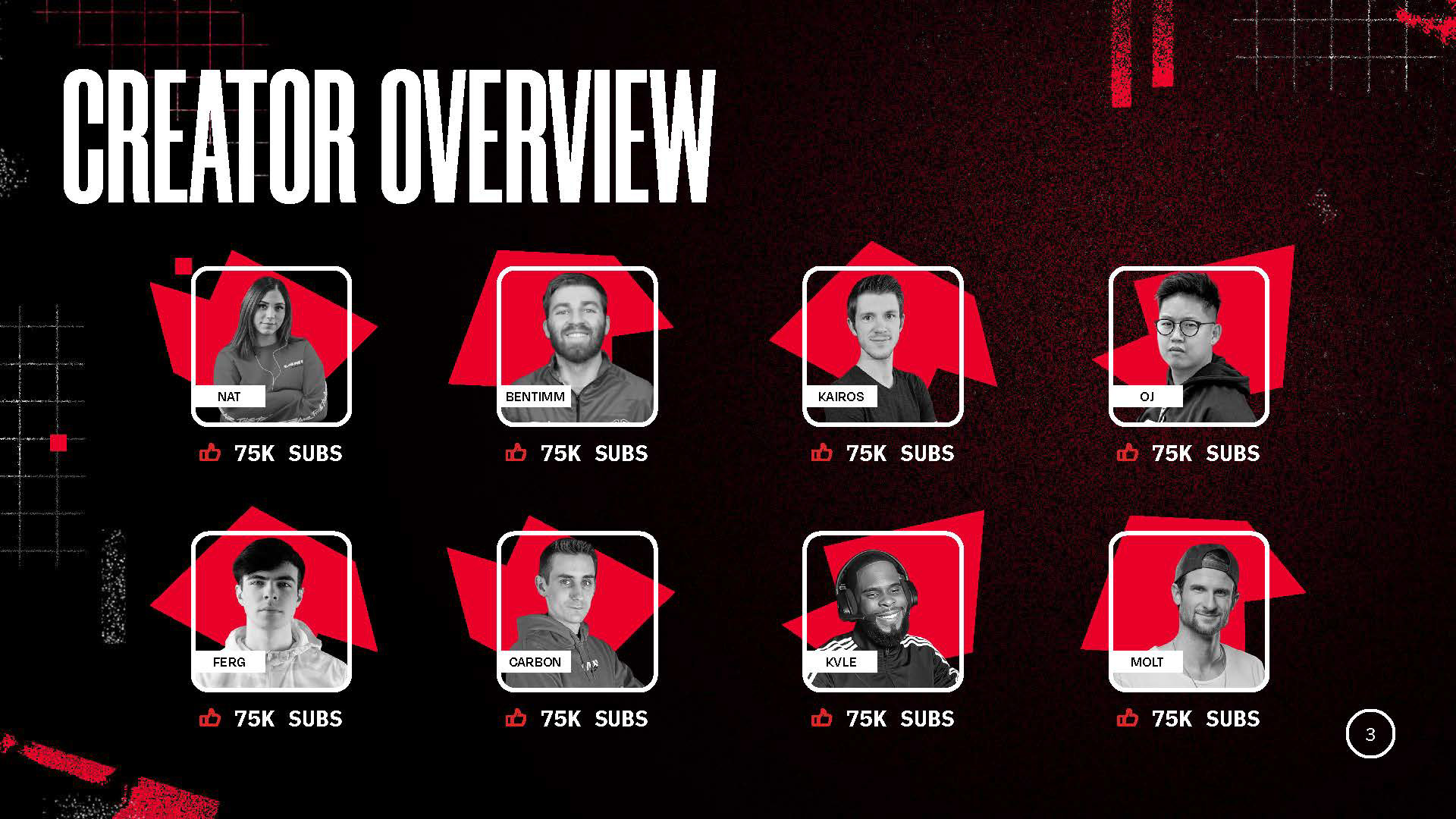
Above are some examples of what I'm given and how I interpret the information into a readable layout. All quantitative data is redacted. I pull thumbnails from provided videos and find imagery even when none is provided (as with the YTD recap) to give slides as much visual interest as possible while keeping the numbers front and center.
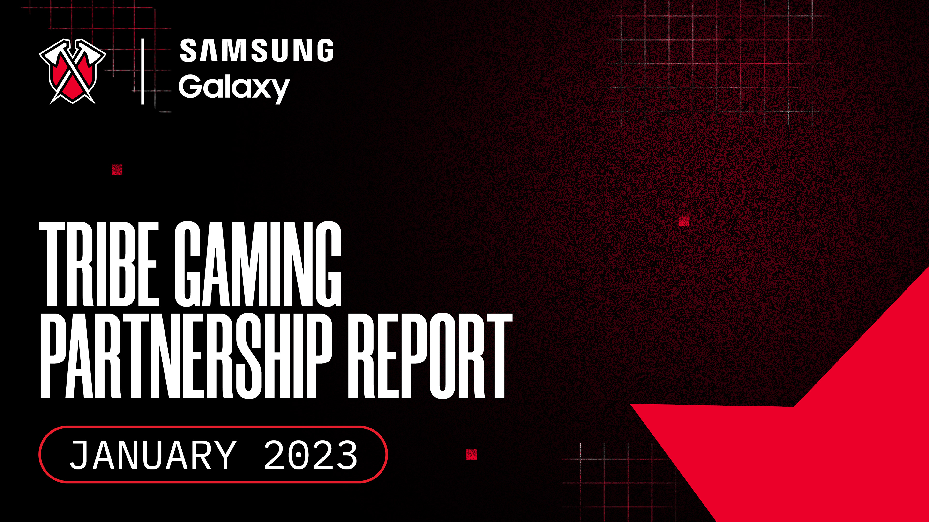
Tribe
Themes
Themes
Our monthly reporting decks are presented in a set visual theme that alternates colourways every month. This general template base saves time when multiple reports are due within a week and keeps Tribe's brand recognisable. We refresh these themes every year. Above are two new templates I created with our most common use-cases.
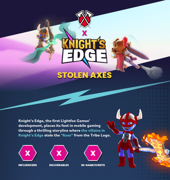
We took inspiration from the Knight's Edge mobile UI and incorporated game sprites.
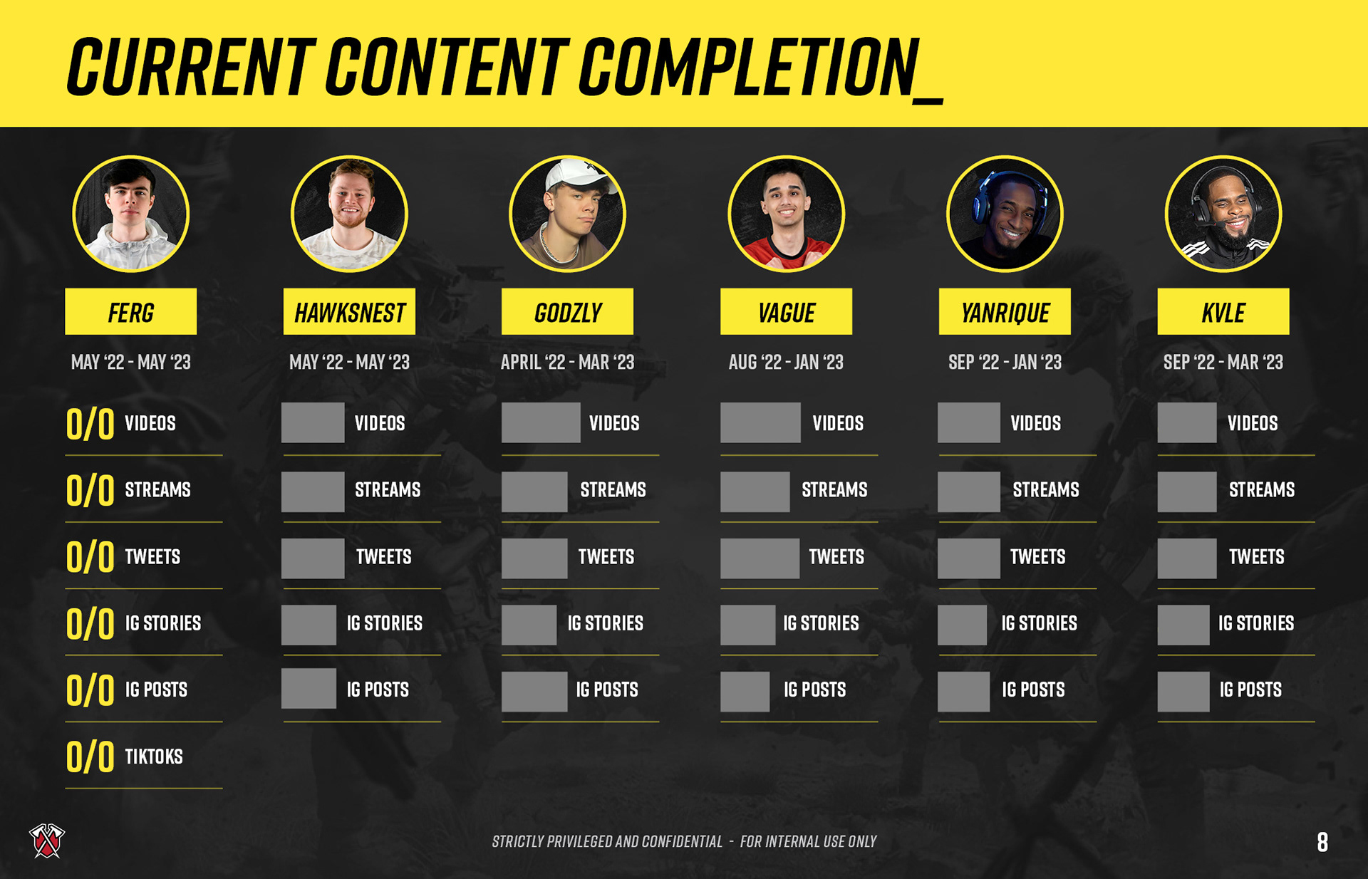
This slide is for a COD Mobile deck, so I relied on the game's black and yellow colour scheme.
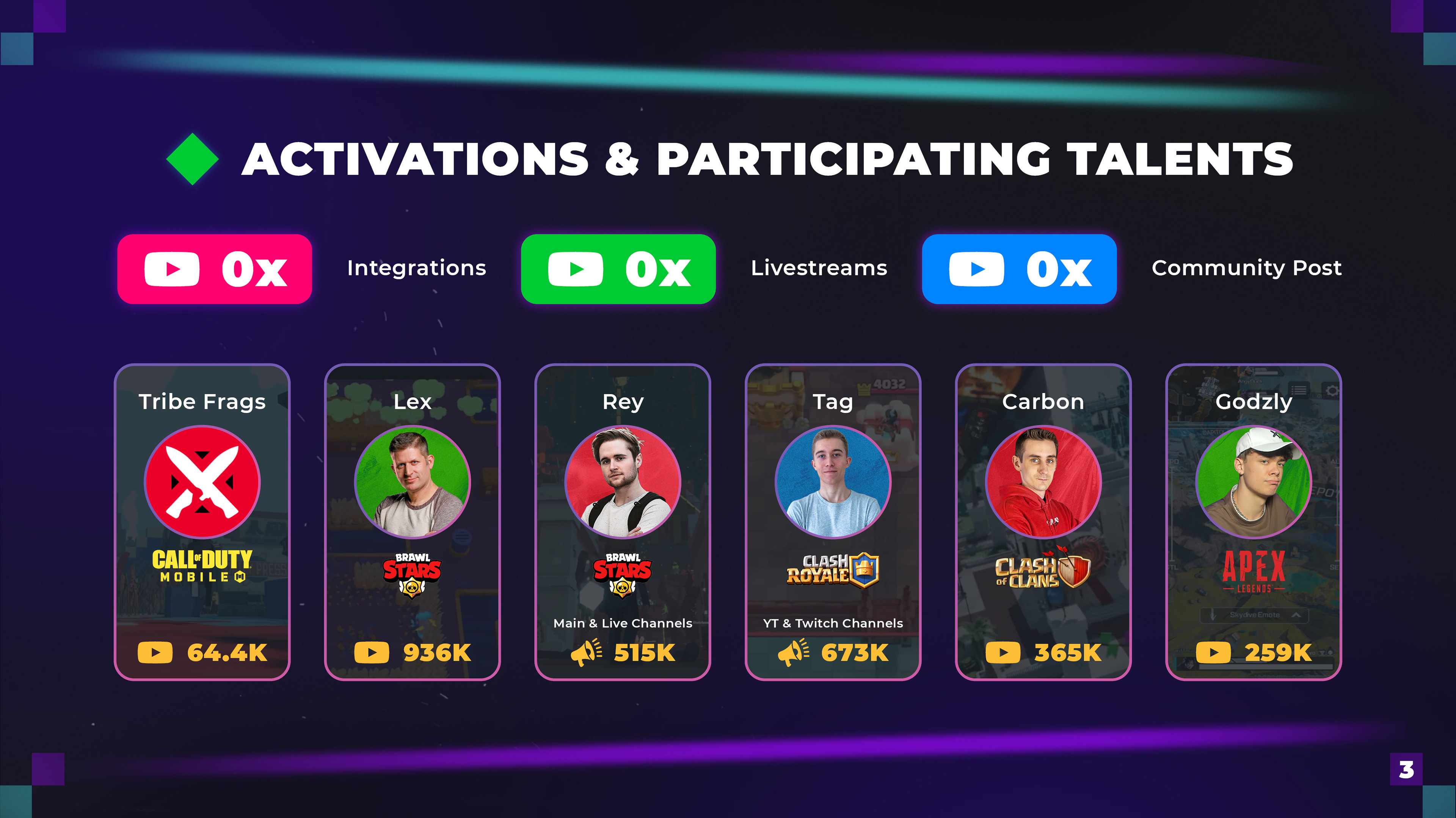
This slide was for a pitch deck to an online game called The Sandbox. These creator cards are based off of the website's UI.
Custom
Themes
Themes
While we rely on a general "Tribe Theme" for our monthly reporting decks, case studies and pitch decks allow me to experiment with visuals. I often take inspiration from the client's branding to create a theme cohesive with their own messaging. When a deck requires very bespoke work, I partner with Ryan McElroy (my boss) to create deck-specific assets to really "wow" prospective clients.
Assets
Each report deck ranges from 8-12 slides, while case studies and pitch decks can get more detailed. All decks go through multiple rounds of revisions and final decks are delivered as hyperlinked PDFs. Decks are made on tight timelines—I'm usually allotted 2-5 days per deck.
Result
As a result of Tribe's wide range of partnerships, I've been able to make decks that are presented to large companies, including Samsung, Ford, Discord, and Razer. Here's a testimony from The Marketing Store, Samsung's agency partner, regarding a deck I made:
"Thank you so much for that AMAZING reporting deck! [...] I think Samsung is going to be blown away, seriously." - Kiki Nesic, TMS
"Thank you so much for that AMAZING reporting deck! [...] I think Samsung is going to be blown away, seriously." - Kiki Nesic, TMS
